
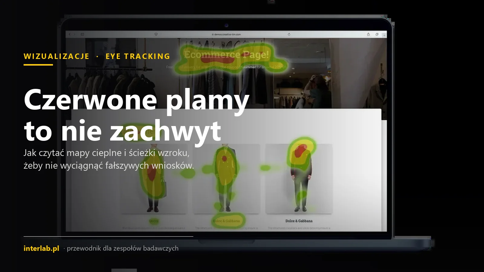
Heat maps and scan paths: how to read eye-tracking results
Heat map, scan path, and bee swarm in Tobii Pro Lab: how they are generated, what they measure, and when they can mislead.
A heat map is not a measurement. It is a summary of gaze points that software has filtered, aggregated, and presented as a color field. This distinction matters because the same recording can be calculated based on fixation count, fixation duration, or relative values. Each variant answers a slightly different question.
In this guide, we compare three Tobii Pro Lab visualizations, demonstrate the technical mechanism behind heat map generation, explain data transfer from wearable eye trackers to a snapshot, and structure AOI metrics. Finally, we discuss scenarios where a visually compelling image can conceal participant variance, mapping errors, or central bias. Our reference points are manufacturer documentation and warnings, not the intuitive meaning of colors.
The same data, two different questions
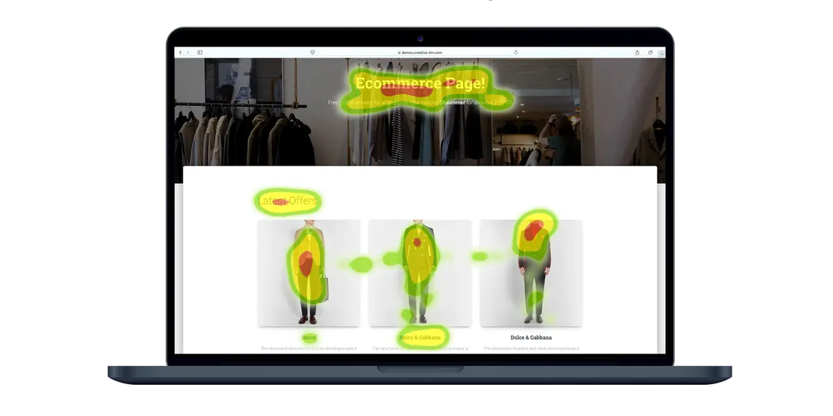
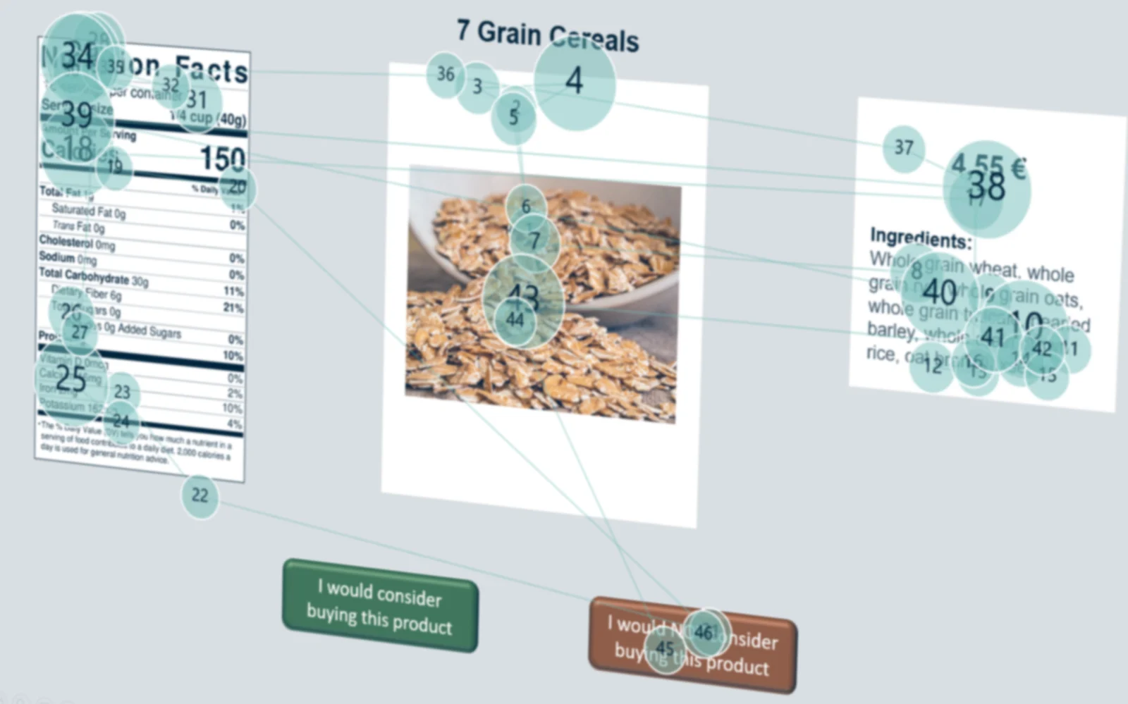
Interpretation key: these are not two measurements, but two ways of presenting the same gaze points.
Key takeaways
- Tobii Pro Lab offers heat map, scan path, and bee swarm. Each visualization answers a different question and uses a different approach to representing time.
- A heat map is constructed mathematically: the I-VT filter can group samples into fixations, and a cubic Hermite spline with a default 50 px kernel creates a smooth distribution.
- Data from glasses and the scene camera require mapping to a snapshot before AOI metrics for real-world objects can be calculated reliably.
- Tobii recommends combining heatmaps with AOI metrics, scan paths, and replays. Central bias and averaging divergent behaviors can distort the picture.
1. Heat map, scan path, and bee swarm: three views of the same data
Heat map aggregates gaze data from multiple participants. Color can encode the number of fixations or samples, or the duration of gaze in a given area. It provides a quick view of group trends, but removes event sequence and individual differences. A hot spot indicates a high value for the selected metric, not automatically interest, comprehension, or a positive reaction.
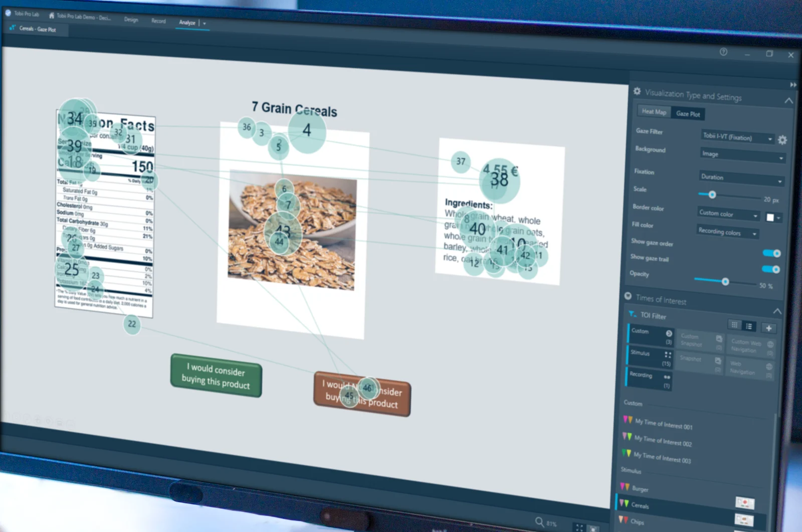
Scan path preserves sequence. Circles represent fixations, their size corresponds to duration, and numbers show order. Lines between them represent saccades. It is an effective view for analyzing text, static stimuli, omissions, and revisits. The name “Gaze plot” is purely historical: in Pro Lab, it was used up to version 1.207, whereas from version 1.217 onwards the current name is Scan path.
Bee swarm answers yet another question: where individual participants are looking at any given moment. It does not combine viewers into a single density field and does not emphasize duration like a scan path. This allows observation of momentary gaze dispersion or alignment, especially in dynamic material.
All three views are built on gaze points — unfiltered x/y coordinates recorded approximately every 1.6–33 ms, depending on device sampling rate. The underlying data is identical; what changes is the question: aggregated intensity, individual sequence, or instantaneous position.
Selecting a view should be preceded by defining the unit of analysis. For group results, a heat map can reveal shared areas, but will not show whether every participant reached them via the same path. A scan path preserves that path, but with many participants or long intervals, it becomes dense and difficult to read. Bee swarm limits temporal history in favor of real-time position. Thus, no single visualization is “most accurate” in isolation from the question; each preserves certain information while deliberately reducing the rest.
2. Three visualizations in Tobii Pro Lab and when to use them
The Visualizations tool in Tobii Pro Lab provides Heat map, Scan path, and Bee swarm layers over an image, snapshot, or blank background. Heat map works well as a concise group summary. Scan path is selected when sequence, duration, and revisits matter. Bee swarm serves to track each viewer’s position at the current moment.
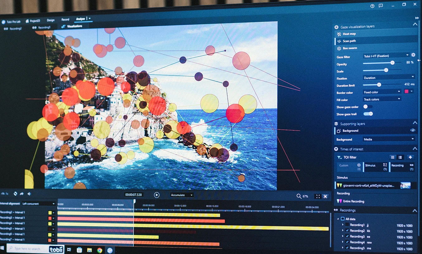
The difference between play modes is substantive. Accumulate adds events as time progresses and is well suited to scan paths. Sliding window shows a moving time window, making it ideal for bee swarm. Dynamic heat maps are available starting in Pro Lab 1.217. The same recording can therefore look different not because the measurement changed, but because the time interval, filter, or scale was altered.
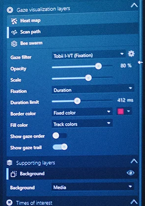
- Gaze filter determines whether the view uses I-VT fixations, among other settings.
- Opacity and Scale change overlay legibility, not measurement quality.
- Fixation: Duration and the 412 ms limit affect circle scaling.
- Show gaze order i Show gaze trail reveal sequence and links.
Saving the configuration is worthwhile even if the map serves only as a report illustration. Without this information, the reader cannot reproduce the view or verify whether differences between conditions stem from participant behavior or settings. A good practice is to review replays prior to aggregation, verify overlay alignment with the stimulus, and only then generate group visualizations. This sequence helps detect data shifts, incorrect time ranges, and individual recordings that disproportionately affect the image.
3. How Pro Lab calculates a heat map
Pro Lab can build a map on raw data or on fixations created by the I-VT filter. In the second case, samples are first grouped using a velocity threshold rule. Their values are then mapped onto the image and summed into adjacent points as well. The influence decreases with distance, resulting in a smooth field rather than a cloud of separate markers.
1 · Raw samples
2 · I-VT fixations
3 · Smoothing
Smoothing approximates a Gaussian curve using a cubic Hermite spline polynomial described by $t^2(3-2t)$. The default kernel radius is 50 px, giving a total kernel diameter of 100 px. This unit has an important consequence: the map depends on screen or scene camera resolution, not on the participant’s field of view. Comparing studies conducted on materials with different resolutions therefore requires consistent settings or conscious normalization.
A static map can use four base metrics: Absolute count, Absolute duration, Relative count i Relative duration. The first two show absolute count or duration, while the latter two relate them to the total within the Time of Interest. Dynamic maps available since version 1.217 are based on Absolute count, but partial fixations are weighted proportionally to time. “Heat” is therefore the output of a specific function and metric choice, not an inherent property of the stimulus.
4. From recording to visualization: mapping data to a snapshot
In screen-based studies, coordinates can be referenced to a static stimulus. In recordings from eye-tracking glasses or scene cameras, however, gaze points are logged relative to individual video frames while objects move within the frame as the participant’s head turns. To analyze a product, shelf, or workstation element as a fixed area, data must be transferred to a shared reference image.
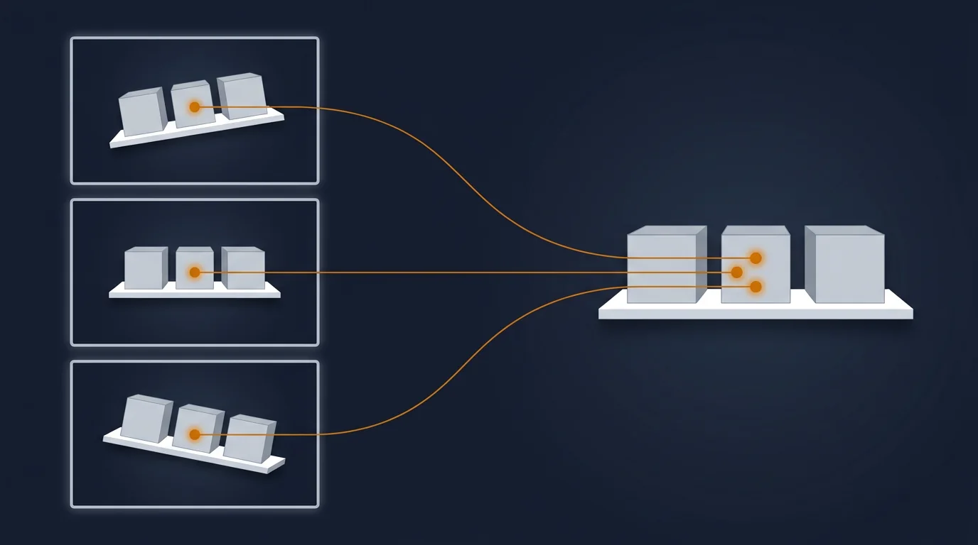
In Pro Lab, that reference image is a snapshot in BMP, PNG, JPG, or JPEG format. Manual mapping involves the analyst pointing to the corresponding location; points are marked with the letter “M”. Assisted mapping automatically processes the selected interval and returns a similarity score between frame and snapshot. Segments above the configured threshold appear green in the interface, while those below appear orange. A low score does not automatically imply an error — it indicates that the algorithm had fewer features to confirm matching.
Tobii recommends that snapshots be as planar as possible, presenting objects at similar distances without severe occlusion. A retail shelf front is a good example. A 3D scene where objects block each other depending on angle increases misallocation risks. Mapping results should be evaluated across the timeline, not solely via a global index.
The standard filter is Tobii I-VT (Fixation). For Tobii Pro Glasses 3 recordings, the manufacturer recommends I-VT (Attention). Filter selection affects sample grouping, and consequently fixations, maps, and AOI metrics. The difference between screen-based and mobile workflows is expanded in the guide on choosing a screen-based or mobile eye tracker.
Mapping should not be treated as an invisible technical step. It establishes the link between a point in a moving frame and the object analyzed downstream. If a snapshot poorly represents the scene or a recording segment has low matching quality, a precisely calculated metric may refer to the wrong location. Quality control should therefore cover both the raw replay and the result after transfer to the reference image, especially at moments of perspective change and object occlusion.
5. Areas of Interest (AOI): what is counted inside
An Area of Interest is a researcher-defined region of the stimulus: a button, label, product, or passage of text. An AOI converts gaze coordinates into variables tied to a hypothesis. It can be static, dynamically track an object in video, or operate at character, word, and sentence levels in Reading metrics.
The distinction between AOI dependent i AOI independentmetrics is crucial. The former describe behavior relative to a specific region: visits, glances, fixations, and saccades within an AOI. The latter contextualize results against the entire Time of Interest, regardless of where the participant looked. Conflating these levels can lead to comparing values with different denominators.
Visit begins with the first fixation inside an AOI and ends with the last; it excludes entry and exit saccades. Glance begins earlier — with the saccade leading into the AOI — and ends with the last fixation, also excluding the exit saccade. The choice of definition should stem from the research question: are we analyzing processing within the region alone, or also orienting gaze toward it.
Therefore, AOIs should not mechanically trace every pixel of an element. System accuracy, viewing distance, stimulus resolution, and analysis goals must be accounted for. The same area geometry must be maintained across compared conditions.
AOI layout should be prepared prior to interpretation, and ideally verified on pilot data before the main study. An excessively broad area may merge different message elements, while an overly tight boundary loses fixations at the edges. In dynamic stimuli, tracking changes in object position and size adds complexity. The final definition must remain identical across compared conditions and be documented alongside mapping rules, filter, and Time of Interest. This ensures that the metric consistently describes the same construct rather than shifting analyst decisions.
6. Key attention metrics in Pro Lab
A heat map helps identify patterns, but hypothesis testing relies on metrics. The interactive tool below uses the same gaze path and AOI. Toggle metrics to see which fixations are included and how their millisecond values are calculated.
| Metric | What it may suggest | What it does not mean on its own |
|---|---|---|
| TTFF (Time to First Fixation) | Rapid discovery of an element | It does not distinguish attractiveness, position, or task relevance. |
| Fixation count / duration | Processing intensity within an AOI | More and longer is not necessarily better; it may indicate difficulty. |
| Dwell time | Total contact with the AOI, including internal saccades | It does not separate engagement from a comprehension problem. |
| Revisits | Reassessment or sustained interest | It does not separate interest from uncertainty without task context. |
| First fixation duration | Initial processing after arrival | It is not an independent measure of emotional impact. |
| Average fixation duration | Average processing duration | It does not identify which parts caused longer fixations. |
| Saccade metrics | Amplitude, direction, latency, and transition dynamics | They do not explain target meaning without the stimulus and AOIs. |
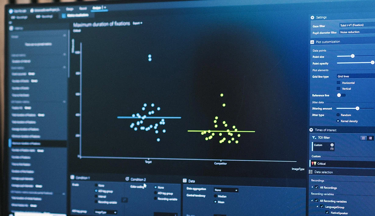
Pro Lab allows visualizing distributions and exporting results for statistical software. No metric direction should be interpreted automatically. Low TTFF can stem from visual saliency, favorable placement, or task relevance; long dwell time can signify engagement or difficulty. Conclusions emerge from a metric suite, condition comparisons, and the underlying hypothesis.
Practical analysis begins by inspecting distributions, missing data, and outliers, rather than looking at means alone. Next, measures covering distinct behavioral stages are compared: reaching the object, processing within the AOI, and subsequent revisits. Convergent directions across multiple metrics can strengthen interpretation, but still cannot replace task context. Divergence is equally informative — rapid arrival followed by long contact reflects a different mechanism than rapid arrival with brief contact. This is why plots and exports are analytically more significant than any single map.
7. When a heat map misleads
Visually, a heat map assumes that participants behaved similarly and observed the stimulus for comparable durations. However, aggregation can combine fundamentally different paths. A single outlier participant can create a hot spot, and calibration drift can shift gaze clusters. Averaging also masks individuals viewing a different object, as well as delayed attentional shifts.
Particularly crucial is central bias: upon stimulus onset, gaze almost immediately targets the center. This is a property of visual behavior, not proof of interest in the central element. The diagram below compares an identical fixation count and equal total dwell time as a function of composition.
Identical local density does not remove the spatial advantage of the center. Location must be controlled in experimental design, not corrected retroactively through map interpretation.
Tobii recommends excluding the early 0.5–1 s period after stimulus onset if the goal is to isolate interest from automatic orientation. Centered and off-center variants should not be compared without accounting for this difference. Heatmaps should always be paired with individual replays, scatter plots, and AOI metrics.
“If you want to test whether a brand, product, or headline actually attracts and holds attention — don’t place it directly in the center of the frame.” — Dr. Tim Holmes, Independent Neuroscientist, Researcher and Educator; translated from original, Tobii, “Expert Eye Tracking Tips”, 2026
8. Practical applications
Visualization selection begins with the research question, not the most visually striking image. The same session may require a qualitative view during exploration and quantitative metrics for hypothesis testing.
UX and interfaces
Heat map highlights attention clusters in a layout, scan path reveals scanning sequence, and AOI TTFF compares element discovery. Results must be controlled against placement and task objectives.
Packaging and display
AOIs on branding, product name, and claim text allow comparing TTFF, dwell time, and revisits. Scan path shows reading order, which aggregated heat maps do not preserve.
Reading and education
Text AOIs and Reading metrics pinpoint regressions to words or sentences. Scan path helps distinguish linear reading from re-reading, though difficulty causes must be confirmed via task design.
Real-world studies
Data from Tobii Pro Glasses 3 is mapped onto a shelf, control panel, or workstation snapshot. Only a shared reference system enables cross-participant AOI comparison.
Bee swarm is particularly useful in dynamic material when real-time gaze synchronization is of interest. Heat map works well for communicating group-level results, but cannot replace distributions and inferential statistics. Scan path is legible for single participants or short intervals; with excess data, it rapidly loses clarity. An effective workflow often combines these views: visualization detects patterns, AOIs formalize the question, and metrics plus condition comparisons verify reproducibility.
In every application, exploratory stages should be separated from confirmatory analysis. During exploration, replays and visualizations help notice unexpected strategies. In confirmatory analysis, regions, intervals, and metrics should follow a predefined plan. This prevents cherry-picking only those maps and areas that look convincing post hoc. Results can then be communicated in layers: a real screenshot shows context, a chart shows distribution, and a metric table answers the research question.
9. Summary
Heat map, scan path, and bee swarm are not mutually exclusive. The first shows aggregated intensity, the second individual sequence, and the third instantaneous position across multiple viewers. Choice depends on the research question and time treatment: accumulation, sliding window, or summary of a selected interval.
A heat map is a mathematical output. Its appearance depends on raw data or I-VT filtering, metric choice, kernel radius, and image resolution. In wearable eye-tracking scenes, snapshot mapping is added, requiring quality verification prior to AOI analysis. Only then does comparing TTFF, duration, fixation count, and revisits become meaningful.
The single most important rule of interpretation is simple: color does not explain cause. Central bias, calibration drift, participant strategies, and task structure can yield identical visual output. That is why Pro Lab offers not only visualizations, but also replays, AOIs, metrics, and data export. Reliable conclusions emerge from their integration alongside explicit analysis settings.
Recording and data analysis systems
Software, hardware, and stimulus presentation form an integrated workflow. The following systems address distinct research requirements: data analysis, controlled screen-based testing, and naturalistic recording.
Tobii Pro Lab
Software environment for experiment design, data processing, visualization, AOI definition, and metric export.
Tobii Pro Spectrum
Screen-based eye tracker for controlled screen and physical stimulus research requiring high data quality.

Tobii Pro Glasses 3
Wearable eye-tracking system for recording visual behavior in naturalistic environments with scene camera video.
Want to see these visualizations on your own data?
Describe your stimulus, participants, research environment, and analytical questions. We will help you select the system, mapping workflow, Pro Lab configuration, and metrics appropriate for your hypothesis.
Sources
- Tobii Connect — Heat maps in Tobii Pro Lab — input data, kernel, smoothing function, and metrics.
- Tobii Connect — Dynamic visualizations for Tobii Pro Lab — Heat map, Scan path, Bee swarm, and time modes.
- Tobii Connect — Understanding Tobii Pro Lab’s eye tracking metrics — definitions and metric dependence on AOIs.
- Tobii Connect — How to perform manual and assisted mapping — snapshots, similarity, and mapping control.
- Tobii Connect — Tobii eye tracker glossary — gaze point, fixation, visit, and AOI concepts.
- Tobii — Expert Eye Tracking Tips, Dr. Tim Holmes — central bias, AOI boundaries, and heat map interpretation.
- Tobii — A complete guide to the fundamentals of eye tracking — measurement fundamentals and data interpretation.